
1 Principle \ Contrast
Why do we need contrast?
First, it is necessary to highlight significant elements.
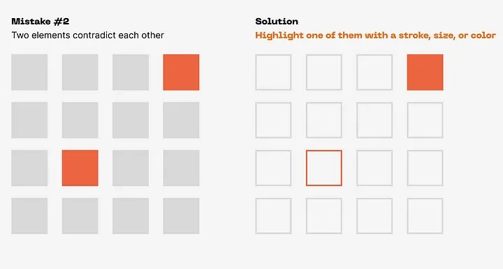
Secondly, to weaken less significant ones, contrast also helps to control a person’s attention and direct him in the right direction. You can use contrast to create hierarchy and structure.
Also, with the help of contrast, you can show a person what is important and what is secondary by analyzing this principle in simple, primitive figures.
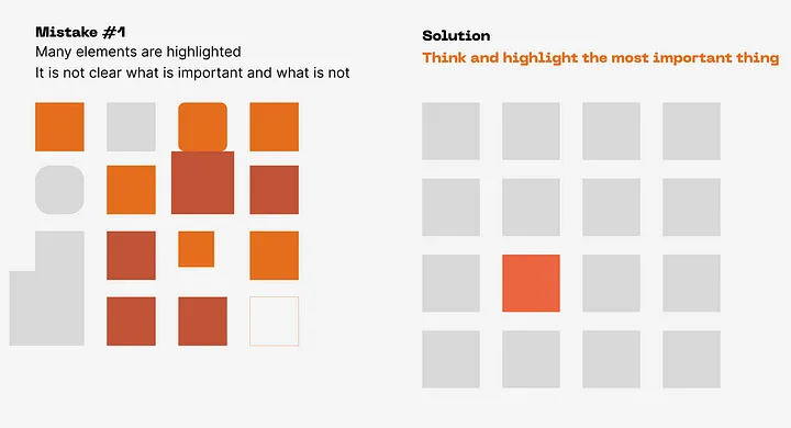
Thus, it is immediately clear which element is the main one
Results.
Highlight the important elements 😊
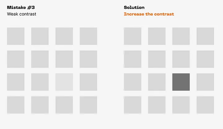
Create an obvious difference
Weaken the less significant
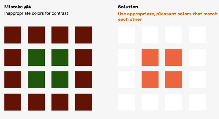
- Do not overuse Can be used everywhere on shapes, lines, icons, images, elements, typography, and wherever else you need to improve contrast!
I’m glad to help you!
If it was interesting and informative guy👏
Add in the comments / /.
And come to my Behance and Dribble
The next article will be about the 2nd principle do not miss! 😉


Топ коментарі (0)